All eyes were on me as we got started. Apparently the host had been bragging about me before I even got there — the pressure was on! I’d love to end the story with how awesome I did, but that would be a lie. I failed. Completely failed. It was a “Pinterest Party” and everyone was to bring a craft idea that they’d pinned. Mine was just a silly paper flower. Easy-peasy, right? Wrong. Oh, so wrong! I did not live up to my friends’ expectations that night!
Easier Said Than Done
I gained a stronger appreciation for crafters that evening and realized some things are easier said than done! What came naturally for that craft blogger stemmed from years of working with paper and their hands, countless experience, probably quite a bit of trial and error, and definitely the correct tools!
I’ve heard others talk about my work as I talked about those paper flowers. “This logo is just text; I could do that.” But it’s easier said than done.
Behind-the-Scenes
What goes on behind the scenes of a simple text-based logo is years of studying typography, tons of experience with tweaking spacing and letterforms, and a knowledge & eye for good fonts.
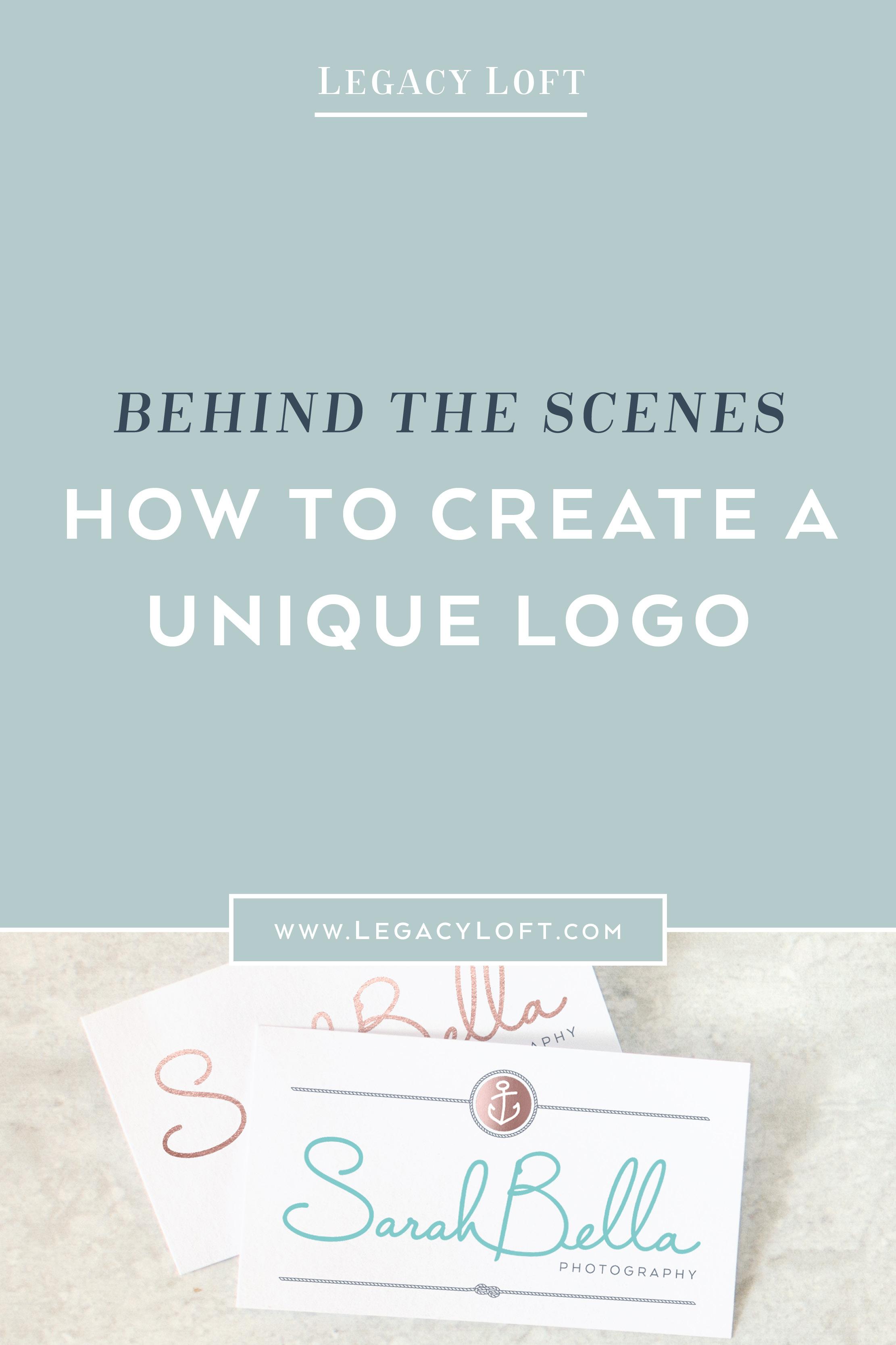
So for funsies, I wanted to give you a behind-the-scenes look of how I crafted the custom logo for Sarah Bella Photography!
Font Choice
We’ll start with the font. Sarah shoots weddings, families and child models, so we needed a font & logo that was romantic, classy and fun! Capistrano seemed to fit those categories – a modern script with a bit of a bounce and rounded edges.
The only problem was, I really didn’t like the capital letters in Capistrano. The top half of the letters are larger than the bottom, making them feel upside-down and imbalanced. The stem coming off the back of the “B” was huge, causing an awkward gap between the two words. The plain text had some of the “fun” factor, but didn’t feel as classy as I wanted. If I had left it at this, the whole mood of the logo would’ve been ruined.
Outlining text in Illustrator makes it easy to manipulate letterforms.
So time for some manipulation! I changed the font to outlines so I could play around with the letters (which is why you should always create a logo in vector format… can’t do this in Canva or Photoshop). From there, I flipped the “S” and “B” so that the bottom half was the larger side. This caused the “B” to look pretty funky and the “S” to be tilting in the wrong direction, so I had to skew the letters to look normal.
The next step involved smoothing out the bottom of the “B” and removing its long tail. I could then scoot the two words closer together to remove the wide gap. I also wanted the words to flow better, so I connected the “H” to the “B,” and the “B” to the “E.” (This is starting to sound like Chicka Chicka Boom Boom, amiright?).
Finally, first section of the logo is done!
The Sub-Text Type Treatment
Sub-text in Arial (example of what not to do).
Final type treatment.
On to the word “Photography!” I wanted a sleek and modern sans-serif font that didn’t detract from the main text. Luckily I’ve gathered quite the collection of beautiful sans-serif typefaces over the years! My font of choice has good curves, a variety of thicknesses to choose from, and a nice “R” (don’t bad “R’s” drive you nuts? See the word in “Arial” to compare). To make the font lighter and more fitting with the look and feel I was going for, I made it a bluish gray and added tracking (read: I made the letters spaced out).
Ok, so our font work is done. Easy, peasy – only took me 5 paragraphs to explain! On to the rest of the design!
The Graphic Elements
Custom Rope brush design.
I chose to hand-draw my graphical elements, so I created the roping and anchor by hand. That makes for unique, never-been-used designs, and saves me from having to search for and purchase a graphical licenses for logo-usage.
Utilizing my custom rope brush.
For the roping, I first created a single section of the rope, duplicated it to make a whole line, and then turned that into a custom brush (confused?). Now I could draw whatever shape I wanted using my unique rope design! That’s how I created the knot in the bottom section and the circle around the top mark! So much fun!!!
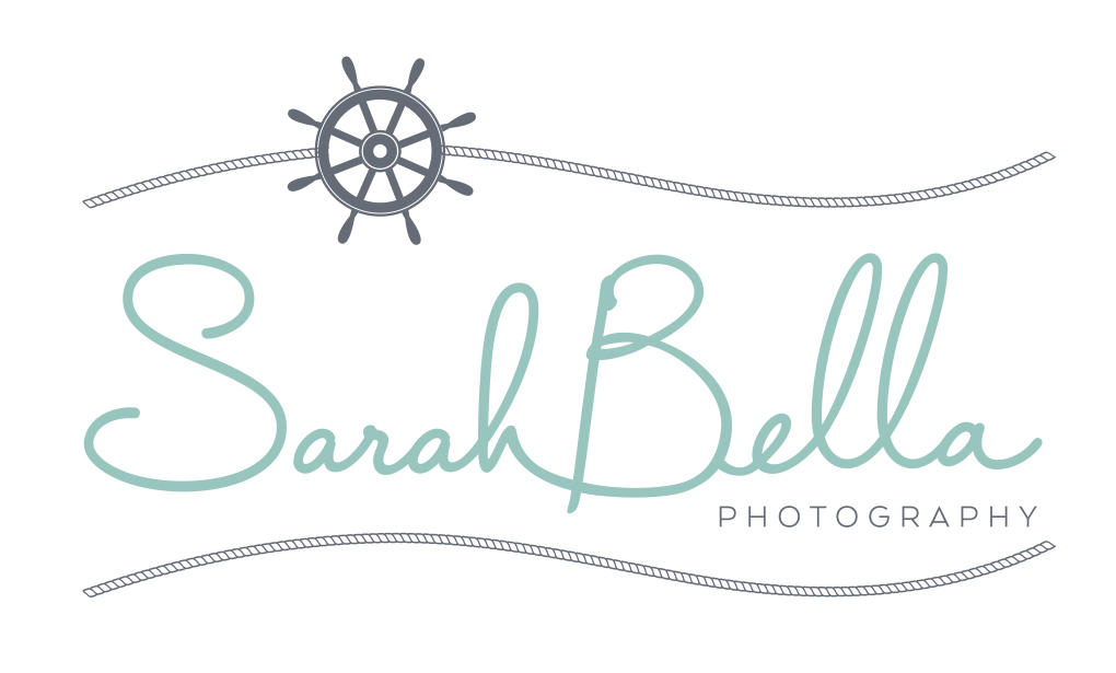
Final Logo design for Sarah Bella Photography.

Initial anchor (left) vs. final design (right)
The Icon/Mark
Finally, on to the anchor! Since the text had a consistent letter width and smooth curves, I wanted to make sure the anchor followed suit! I drew a very basic anchor with even-width lines to start, but it was way too generic and plain! A little tilt here, a little angle there – and the anchor now has character and life!
This was just one of many designs I provided Sarah with… I have a similar process for every single option I send! It’s a lot of work, but it’s so worth it! And that’s why Sarah hired me for a custom, professional design! She now has a logo like no other that’s out there on a stock image site, Canva, Fiverr, Pinterest or Etsy!


See her logo in action here and make sure to check out her beautiful work!
I’d love to know what YOU do and what all goes into it that no one thinks of! I love learning about other people’s crafts! Leave a comment below!