MOSEAARON Branding

Mood Board
Initial Design Concepts
(Click to enlarge)
OUR ROLE
Logo
Brand Style
PROJECT OVERVIEW
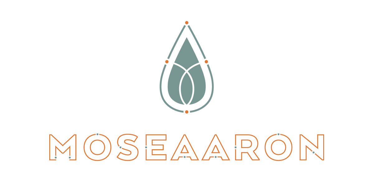
I was excited when a former brand client came to me for branding her new startup, Moseaaron, a nutrition brand focused on bringing Biblical principles into today’s diet and lifestyle (Moses + Aaron = Moseaaron). Their supplements contain variants of vitamins, minerals, herbs and botanicals. I wanted the logo to have a very modern feel while embodying elements of the Bible and/or organic nutrition. The final logo is comprised of an almond shape to represent Aaron’s staff that budded and grew almonds. The also represents a drop of essential oils. Within the icon you’ll find a subtle Christian fish, as well as dots that represent supplemental elements.
VIEW MORE