Out of the 500+ channels we have through Comcast, there’s only one I tune in to — HGTV. I’m usually on the computer while watching, only half listening… until… the big reveal! Then it’s all eyes on the screen as I gawk over the before & after transformation, taking mental notes of the décor and style choices.
My all-time favorite is Fixer Upper, combining Chip’s quirkiness (is that a word?) with Joanna’s charming country style **sigh** I just want to buy every house they design!

Since January, I’ve been working on my own fixer upper. No, not my house– those projects are on hold – but on my website and branding. Unfortunately, in my excitement for “demo day,” I tore down my old site without taking any “before” screen shots... so no big 'ole "reveal" for me! Waa waa!
Good thing I have a few images saved from a year ago when I rebranded.
Wait, Lauren, why did you rebrand again so soon?
Umm, I’ve actually rebranded about four times (drops head).
Let me explain…
When creating my original logo for “Lauren Black Graphic Design,” I threw something together in a night. Literally, one night… I was trying to catch the Cyber Monday sale with Moo business cards. Fail. I’m a little too embarrassed to post those.
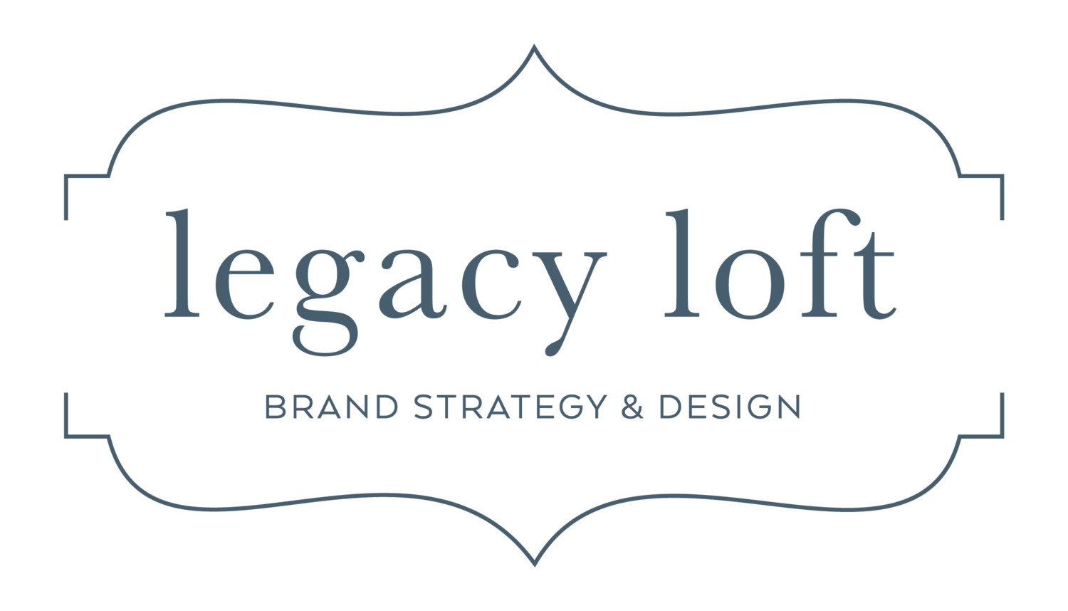
I soon got into designing & embellishing wedding invitations with my mom, whose scrapbook room puts Joann Fabrics to shame. Together we started and named Legacy Loft (I’ll spare you the details for now) and created a logo and Facebook page for our new business!
I still have boxes of those business cards lying around. They make for good bookmarks and note cards… because you wouldn’t let 487 extra business cards go to waste, right? Wait, did I buy 500 total, or 500 for both my mom and myself?
But I digress…
My next rebrand I attribute to “shiny design syndrome.” Script logos were all the rage, and I was just tired of my old look and feel. I forget the concept behind this one, but I was basically aiming for something “pretty” that would attract brides. I built a cheapo Prosite website, which didn’t support my growing business, and found myself redesigning my website through Squarespace a year later.
I kept the logo the same through the website overhaul, but now needed web banners and blog post images. Falling trap to “shiny design syndrome” again, I tried the whole "flat lay" look. A few months in, I just wasn’t feeling it and I redesigned all of my blog images with the “white text on a dark overlay above a photo” look.
The real problem…
While “shiny design syndrome” was an issue, as well as designing a logo & look in a night, the real problem was the lack of focus and purpose. I technically wasn’t ever “rebranding” because I didn’t have “branding” in the first place – I had a logo and some design elements, but lacked cohesive messaging, colors and marketing.
While my logo and website weren't horrible (I actually got a lot of complements on the last website), I wasn't landing the clients I really wanted to design for: small business owners. I absolutely love working with photographers, coaches, creatives – those with an eye for good design and an appreciation for work that’s elegant and sophisticated. But my website wasn’t marketed towards those clients... it wasn't marketed towards anyone!


It was time for a complete overhaul — one where I treated myself like a client and stopped myself from being like the dogs from Up that got side-tracked every time something new crossed the path. Squirrel!
I refined my ideal client profile and shaped my branding around it. I made sure my logo, colors, messaging, marketing, and social media presence worked for one another, rather than pulling in different directions.
Thanks for coming by! Make sure to stick around and check out our new site, with never-been-seen projects that I finally got around to posting in my portfolio! Shoot me a message if you’d like to chat — about branding, business, design — doesn't matter, I just love meeting new people!