Photos of whale tales, waterfalls, snow-clad mountain peaks, and tropical beaches have overtaken the digital picture frame in my kitchen. Any stranger could tell that my husband and I have been struck with wanderlust – big time! We’ll start planning for our next vacation at the end of a current trip, taking full advantage of our two weeks off. The sights, the smells, the food and the memories – there’s nothing better!

Take Me There
When you hear “Charleston,” what do you visualize? I think of horse and carriages trotting down brick laid streets between charming colonial houses, as friends gather for lemonade and cheese platters on their white piazzas. It’s Southern hospitality at its finest!
How about Seattle? Pike’s Place market comes to mind – fresh produce and flowers, chowder galore, stained glass artwork and of course, a Starbucks on every corner! If you’ve never been to Seattle, you need to visit just for the smell, if nothing else! The entire city carries a sweet aroma of coffee and pastries (If Yankee Candle made a “Seattle” scent, I’d buy a lifetime supply).
But this post isn’t about traveling…
When working with my brand clients, I ask that they come up with a brand “city” to connect their key words to their visuals. Wait, you do have key words, right? If not, read this, then come back. Don’t worry, I’ll wait!
Connecting Your Key Words
While key words are an essential part of your branding, they’ll be wasted if not connected to your aesthetics. It’s called a look and feel for a reason – in order to emotionally connect with your clients. Give ‘em goose bumps. Make ‘em cry. You can’t do that if your visuals speak a different language than your messaging.
To accomplish a cohesive look and feel, first think of words that characterize who you are, the heart behind your business, and the feelings you want your clients to experience. Use those words to select a visual representation of your brand. Use a city – or a TV show, retail store, magazine, food… anything with a very defined, specific style that’s easily recognizable (and please don’t use your competition – that doesn’t go over too well). You can also combine elements to create something fun and unique!
Anthropologie meets Downtown Savannah
Jolly Ranchers meet Ikea
Lilly Pulitzer meets Key West
Napa Valley meets Pottery Barn
Candlelit Dinner meets the Almafi Coast
But Why...
When choosing your brand’s visual representation, think through why you’re choosing that to signify your business. Perhaps your key words are “bright, lively and sparkling” – you immediately think of Vegas for its neon lights and energetic streets, New Year’s Eve for the champagne and crystal ball drop, and a ski resort for the bright white, glistening snow! Those are three very different aesthetics, so think through which one best represents the brand you’re striving to build and the clients you want to reach.
Explaining why you’re choosing a specific brand “city” is also critical for communicating with your designer, copywriter, or anyone else handling your brand elements. If you ask 10 people to make a mood board for “Cape Cod” – you could get 10 completely different visuals. But if you tell them your brand represents Cape Cod’s nautical colors, laid back atmosphere, and welcoming lighthouses… that paints a clear picture!
And Finally, Colors!
Once you have a clear picture of your “city” or other representation, you should be able to determine colors. I’ve talked to many small business owners who have said, “I have my colors, but haven’t figured out my brand messaging or logo yet.” Hun, if you don’t have brand messaging, how can you have colors? Do you shop at Target because their logo is red? Do you avoid Starbucks because you hate the color green? Don’t get me wrong, colors do play a major role in your branding, but they shouldn’t be the driving force behind your brand decisions!
Every choice you make, including your colors, should have purpose and intention! They tie back to your key words, which are built from the heart of your business and defining your ideal clients. If you feel I’m repeating myself, it’s only because I cannot stress enough the importance of a cohesive (and effective) brand.
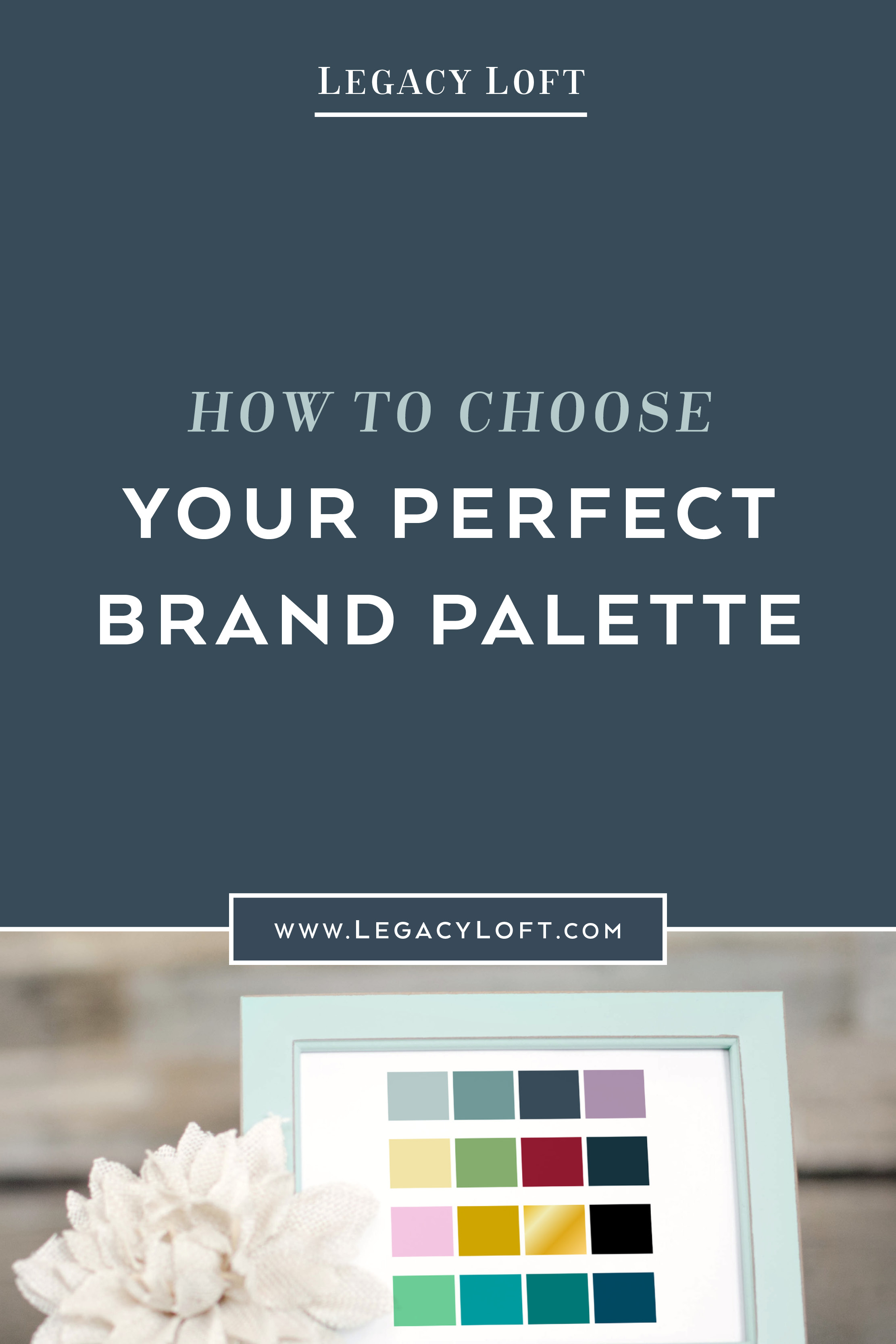
So back to colors…. There are certain palettes that just flow better with certain groups of words. Check out a few suggestions below.
Inviting, welcoming, soft, elegant, sympathetic, nurturing, gentle – try a muted color palette and avoid stark white and deep black. Try a gray with blush pink; slate blue with beige; lavender with light teal; or muted mint with soft gray.
Cutting edge, dramatic, high end, resilient, expert, practical, driven – try hot pink and black; steel blue with silver; black and gold; lime green and plum.
Ambitious, friendly, significant, warm, hearty, enthusiastic, reliable – try red, burnt orange and brown; straw and cobalt; navy and burgundy; sage, tan and mustard.
Positive, sparkling, imaginative, bright, lively, youthful – try coral and mint; aqua and lemon; creamsicle, bubblegum and turquoise; baby blue and cherry.
Your Visual Guide
Use the “city” concept as a guideline, not a boundary. I chose “Waco Texas” for the sole purpose of HGTV star, Joanna Gaines’ farmhouse decorating style. I paired that with shabby chic flowers I pulled from a website I liked. Together, they represented my key words and provided me with a good base to build my mood board and colors on. While creating my brand elements, I would ask myself, “Would Joanna Gaines use this website template,” or “Does this frame flow with my mood board and key words?”
What good are your key words and mood board if you don't use them?
While it’s probably easier to think of a city or visuals first, I highly recommend you develop your key words prior to adding aesthetics. But Lauren, that’s so much harder! Trust me, as a designer, I’m all about the visuals… but I’ve also seen how off-path your branding can get when you don’t work from the ground up! Key words are foundational – you can’t paint the house until you have walls!
If you create your key words with research, purpose and intention, and select a “city” or visual representation to develop your aesthetics from, your brand will stay focused and will have a stronger connection with your ideal clients!
What is your brand “city”? Let us know in the comments below. Then come back next week to learn how to create a mood board that embodies your visual representation.